Everybody has probably already realized that there is almost no data that we cannot get. We can get data about our website by using free tools, but we also spend tons of money on paid tools to get even more. Analyzing the competition is just as easy, competitive intelligence tools are everywhere, we often use Compete or Hitwise. Opens Site Explorer is great for getting more data about our and competitors backlink profile. No matter what information we are trying to get, we can, by spending fortunes or no money. My favorite part is that almost every tool has one common feature and that is the "Export" button. This is the most powerful feature of all these tools because by exporting the data into Excel and we can sort it, filter it and model it in any way we want. Most of us use Excel on the regular basis, we are familiar with the basic functions but Excel can do way more than that. In the following article I will try to present the most common statistical techniques and the best part it is that we don't have to memorize complicated statistical equations, it's everything built into Excel!
Statistics is all about collecting, analyzing and interpreting data. It comes very handy when decision making faces uncertainty. By using statistics, we can overcome these situations and generate actionable analysis.
Statistics is divided into two major branches, descriptive and inferential.
Descriptive statistics are used when you know all the values in the dataset. For example, you take a survey of 1000 people asking if they like oranges, with two choices (Yes and No). You collect the results and you find out that 900 answered Yes, and 100 answered No. You find the proportion 90% is Yes 10 is No. Pretty simple right?
But what happens when we cannot observe all the data?
When you know only part of your data than you have to use inferential statistics. Inferential statistics is used when you know only a sample (a small part) from your data and you make guesses about the entire population (data).
Let's consider you want to calculate the email open rate for the last 24 months, but you have data only from the last six months. In this case, assuming that from 1000 emails you had 200 people opening the email, which resulted in 800 emails that didn't convert. This equates to 20% open rate and 80% who did not open. This data is true for the last six months, but it might not be true for 24 months. Inferential statistics helps us understand how close we are to the entire population and how confident we are in this assumption.
The open rate for the sample may be 20% but it may vary a little. Therefore, let's consider +- 3% in this case the range is from 17% to 23%. This sounds pretty good but how confident are we in these data? Alternatively, what percentage of a random sample taken from the entire population (data set) will fall in the range of 17%-23%?
In statistics, the 95% confidence level is considered to be reliable data. This means 95% of the sample data we take from the entire population will produce an open rate of 17-23%, the other 5% will be either above 23% or below 17%. But we are 95% sure that the open rate is 20% +- 3%
The term data stands for any value that describes an object or an event such as visitors, surveys, emails.
The term data set has two components, observation unit, which is for example visitors and the variables that can represent the demographic characteristics of your visitors such as age, salary or education level. Population refers to every member of your group, or in web analytics all the visitors. Let's assume 10,000 visitors.
A sample is only a part of your population, based on a date range, visitors who converted, etc. but in statistics the most valuable sample is considered a random sample.
The data distribution is given by the frequency with which the values in the data set occur. By plotting the frequencies on a chart, with the range of the values on the horizontal axis and the frequencies on the vertical axis, we obtain the distribution curve. The most commonly used distribution is the normal distribution or the bell-shaped curve.
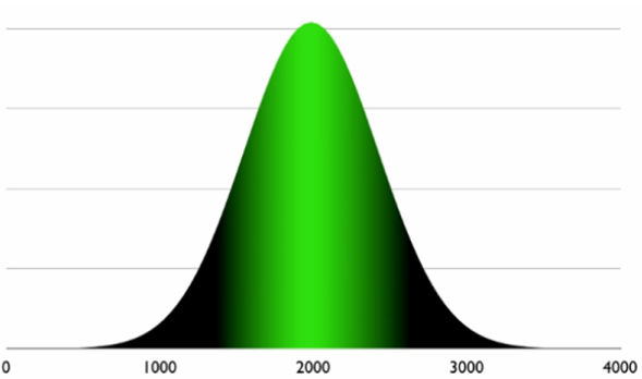
An easy way to understand this is by considering the number of visitors a website has. For example the number of visits are on average of 2000/day but it happens to have more visits such as 3000 or less 1000.
Here, probability theory comes in handy.
Probability stands for the likelihood of an event happening such as having 3,000 visitors/day and is expressed in percentages.
The most common example of probability that probably everybody knows is the coin flip. A coin has two faces, head and tail, what is the probability when flipping a coin to have head? Well there are two possibilities so 100%/2=50%.
Enough with theories and let's get a little bit more practical.
Excel is an amazing tool that can help us with statistics, it's not the best but we all know how to use it so let's dive right into it.
First, install the Analysis ToolPack.
Open Excel, Go to Options -> Add-ins->at the bottom we will find
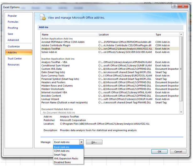
Hit Go ->select Analysis ToolPack->and click OK.
Now under the Data tab we will find Data Analysis.

The Data Analysis tool can give you supper fancy statistical information but first let's start with something easier.
Mean, Median, and Mode
Mean is the statistical meaning of average, for example the mean or average of 4,5,6 is 5 how we calculate in excel the mean? =average(number1,number2,etc)
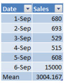
Mean=AVERAGE(AC16:AC21)
By calculating the mean we know how much we sold on average. This information is valuable when there are no extreme values (or outliers). Why? It looks like we sold on average $3000 worth of products, but actually we were lucky that somebody spent more on September 6. But actually we did pretty poorly during the previous six days, with an average of only $618. Excluding the extreme values from the mean can reflect a more relevant performance rate.
The median is the observation situated in the middle of the data set. For example, the median of 224, 298, 304 is 298. In order to calculate the mean for a large set of data we can use the following formula =MEDIAN(224,298,304)
When is the median useful? Well, the median is useful when you have a skewed distribution, for example you are selling candies for $3 up to $15 a bag but you have some very expensive candies for $100 a bag that nobody really purchases on a regular basis. At the end of your month you have to make a report and you will see that you sold mostly cheap candies and only a couple of the $100. In this case calculating median is more beneficial.
The easiest way to determine when to use the median vs. the mean is by creating a histogram. If your histogram is skewed with an extreme, then you know that the best way to go is by calculating the median.

The mode is the most common value, for example the mode for: 4,6,7,7,7,7,9,10 is 7
In Excel you can calculate the mode by using the =MODE(4,6,7,7,7,7,9,10) formula.
Although this looks nice keep in mind that in Excel the lowest mode is considered, or in other words, if you have to calculate the mode for the following data set 2,2,2,4,5,6,7,7,7,8,9 you can see that you have two modes, 2 and 7 but Excel will show you only the smallest value: 2.
When can we use the mode function? Calculating the mode is beneficial only for whole numbers such as 1, 2 and 3. It is not useful for fractional numbers such as 1,744; 2.443; 3,323, as the chance to have duplicated numbers, or a mode, is very small.
A great example of calculating the mode, or the most frequent number, will be probably on a survey.
Histograms
Let's say your blog recently received hundreds of guest posts, some of them are very good ones but some of them are just not that good. Maybe you want to see how many of your blog posts received 10 backlinks, 20, 30 and so on, or maybe you are interested in social shares such as tweets or likes, but why not just simply visits.
Here we will categorize them into groups by using a visual representation called histograms. In this example I will use visits/articles as an easy example. The way I setup my Google Analytics account is as follows. I have a profile that tracks only my blog, nothing else. If you don't have such profile setup yet, then you can create a segment on the fly.
How are you doing this? Pretty simple:

Now go to export->CSV
Open the excel spread sheet and delete all the columns except for Landing Page and Visits. Now create the ranges (also called bins) that you want to be categorized into. Let's say we want to see how many articles generated 100 visits, 300, 500 and so on.
Got to Data -> Data Analysis->Histograms->OK

- Input range will be the visits column
- Bin Range will be the groups
- Output Range, click on the cell where you want your histogram to show up
- Check Chart Output
- Click OK
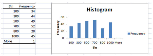
Now you have a nice histogram that shows you the number of articles categorized by visits. To make it easier to understand this histogram, click on any cell from the Bin and Frequency table and sort the frequency by low to high.
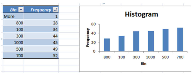
Analyzing now the data is even easier. Now go back and sort all the articles with less or equal to 100 visits (Visit drop down->Number filters->Between...0-100->Ok) in the last month and update them, or promote them.
Visits by source
How valuable this report is for you?

It's pretty good but not amazing. We can see ups and downs but...how much did YouTube contribute in February to the total visits? You can drill down but that is extra work, and it is very uncomfortable when the question arrives on a phone call with a client. To get the most out of your graphs, create valuable self-descriptive reports.
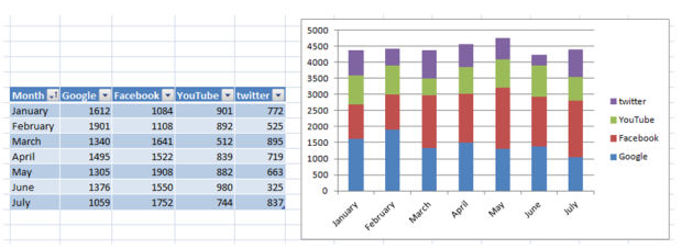
The report above is so much easier to understand. It takes more time to create it but it's more actionable.
What we can see is that in May, Facebook had a bigger amount of contribution to the total than in general. How come? Probably the May marketing campaign was more effective than in other months, resulting in a lot of traffic. Go back and do it again! If it was a working solution, then repeat it.
If you consider that May is just by chance bigger than the rest of the months, then you should create a Chi-Square Test to make sure that the increase in visits is not by chance and it is statistically proven the effectiveness of your campaign.
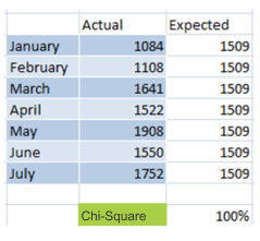
The actual column is the number of visits, the expected column is the Mean(average) of the "actual" column. The formula of the Chi-Square test is =1-CHITEST(N10:N16,O10:O16) where N10:N16 are the values from Actual and O10:O16 the values from Expected.
The result of 100% is the confidence level that you can have when considering that the work invested in every month campaign impacts the number of visitors coming from Facebook.
When creating metrics, make them as easy as possible to understand, and relevant to the business model. Everybody should understand your reports.
The video below explains pretty well another example of Chi-Square function:
https://www.youtube.com/watch?v=UPawNLQOv-8
Moving average and linear regression for forecasting

We often see graphs like the one above. It can represent sales or visits, it doesn't really matter, it is constantly going up and down. There is a lot of noise in the data that we probably want to eliminate to generate a better understanding.
The solution, moving average! This technique is sometimes used by traders for forecasting, the Stock prices are booming one day but in the second they are hitting the floor.
Let's see how we can use their basic techniques to make it work for us.
Step 1:
Export to excel the number of visits/sales for a long time period, such as one or two years.
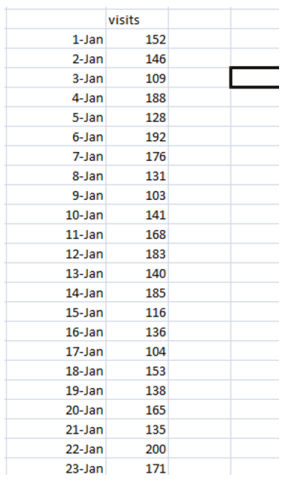
Step 2:
Go to Data-> Data Analysis -> Moving Average ->OK
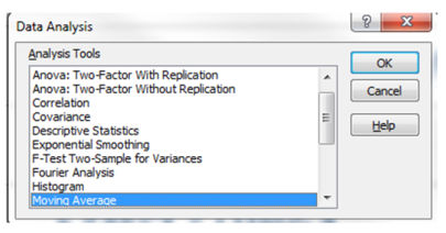
Input range will be the column with the number of visits
Interval will be the number of days on which the average is created. Here you should create one moving average with a higher number such as 30 and another one with a smaller number such as 7.
Output range will be the column right next to the visits column.
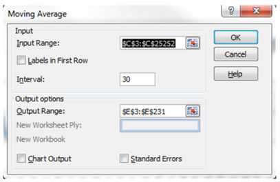
Repeat the steps for the interval of 7 days
Personal Preference: I didn't check the chart output and standard error box on purpose, I will create a graph later on.
Your data now probably looks similar to this:
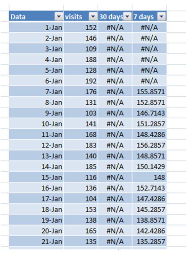
Now if you select all the columns and create a line chart it will look like this:
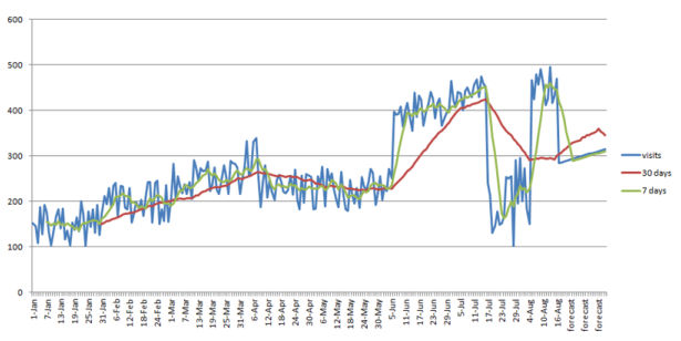
This representation has less noise, it is easier to read and it shows some trends, the green line cleans up a little bit in the chart but it reacts to almost every major event. The red line instead is more stable and it shows a real trend.
At the end of the line chart you can see that it says Forecast. That is forecasted data based on previous trends.
In Excel there are two ways for creating a linear regression, using the formula =FORECAST(x,known_y's, known_x's) where "x" stands for the date you want to forecast, "known_y's" are the visits column and "known_x's" are the date column. This technique is not that complicated but there is an easier way to do this.
By selecting the entire visits column and dragging down the field handle it will automatically forecast for the following dates.
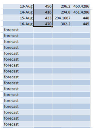
Note: Make sure to select the entire data set in order to generate an accurate data set.
There is a theory when comparing a 7day moving average and a 30day. As said above the 7day line reacts to almost every major change while the 30day one requires more time to change its direction. As a rule of thumb when the 7day moving average is intersecting the 30day moving average then you can expect a major change that will last longer than a day or two. As you can see above around April 6th the 7 day moving average is intersecting the 30 day one and the number of visits are going down, around June 6th the lines are crossing again and the trends are going upward. This technique is useful when you are losing traffic and you are not yet sure if it is just the trend or it is just a daily fluctuation.
Trendline
The same results can be achieved by using the trend line feature of excel: Right click on the wiggling line -> select: Add Trendline
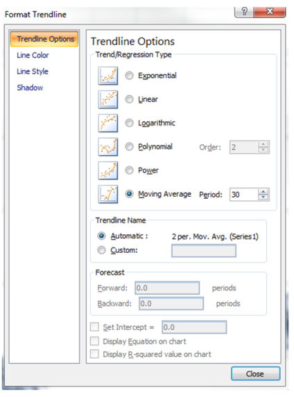
Now you can select the Regression Type and you can use the Forecast feature as well. Trendlines are probably the most useful to find out if your traffic/sales are going upward, downward or are simply flat.
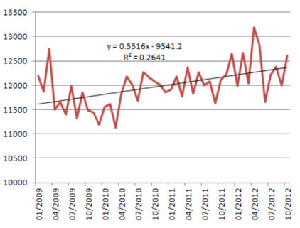
Without the linear function we cannot confidently tell if we are doing better or not. By adding a linear trendline we can see that the slope is positive the trendline equation explains how our trend is moving.
y=0.5516x-9541.2
X represents the number of days. The coefficient to x, 0.5516, is a positive number. This means that the trendline is going upward. In other words every day that passes by we increase the number of visitors with 0.5 as a trend.
R^2 represents the level of accuracy of the model. Our R^2 number is 0.26 which implies that our model explains 26% of the variations. Simply said: we are 26% confident that every other day that passes by our number of visitors increases with one new visitor.
Seasonal Forecasting
Christmas is coming soon and forecasting the winter season can be beneficial especially when your expectations are high.
If you didn't get hit by Panda or Penguin and your sales/visitors are following a seasonal trend, then you can forecast a pattern for sales or visitors.
Seasonal forecasting is technique that enables us to estimate future values of a data set that follows a recurring variation. Seasonal datasets are everywhere, an ice cream store will be very profitable during the summer season and a gift store can reach the maximum sales during the winter holidays.
Forecasting data for near future can be very beneficial, especially when we planning to invest money in marketing for those seasons.
The following example is a basic model but this can be expanded to a more complex one to fit your business model.
Download the Excel forecasting example
I will break up the process into steps to be easier to follow. The best way to implement it for your business is by downloading the Excel spreadsheet and following the steps:
- export your data, the more data you have the better forecasting you can make! and place the dates into column A and sales into column B.
- Calculate the index for each month and add the data in column C
In order to calculate the index scroll down at the bottom right of the spreadsheet and you will find a table called Index. The index for Jan-2009 is calculated by dividing the sales from Jan-2009 by the average sales of the entire year 2009.
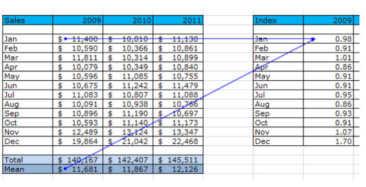
Repeat calculating the index for every month of every year.
In column S38 to S51 we calculated the average index for every month

Because our seasonality is every 12 month we copied the index means into column C over and over again matching up every month. As you can see January of 2009 has the same index data as January 2010 and 2011
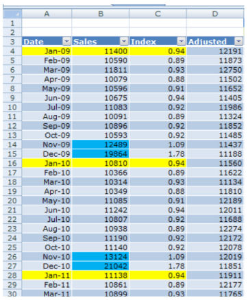
- In column D calculate the Adjusted data by dividing the monthly sales by the index =B10/C10
- Select the values from column A, B and D and create a line chart
- Select the adjusted line (in my case the Red line) and add a linear trendline, check the "Display Equation on Chart" box
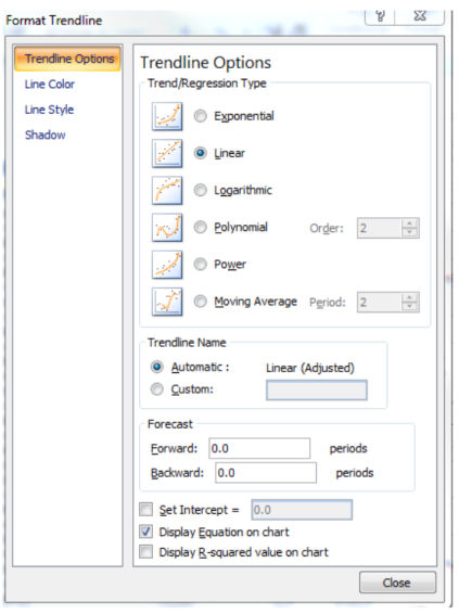
- Calculate the backcasted non-seasonal data by multiplying the monthly sales by the coefficient from the trandline equation and adding the constant from the equation (column E)
After creating the trendline and we displayed the Equation on the chart we consider the Coefficient the number which is multiplied by X and the constant the number that is usually has a negative sign.
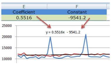
We place the coefficient into cell E2 and the Constant into cell F2
- Calculate the Backcasted Seasonal data by multiplying the index (column C) with the previously calculated data (column E)
- Calculate MPE(mean percentage error) by dividing sales by Backcasted seasonal minus 1 (=B10/F10-1)
- Calculate MAPE (mean adjusted percentage error) by squaring the MPE column (=G10^2)

In my case cell F50 and F51 represents the forecasted data for Nov-2012 and Dec-2012. Cell H52 represents the error margin.
By using this technique we can say that in December 2012 we are going to make $22,022 +- 3.11%. Now go to your boss and show him how you can predict the future.
Standard deviation
Standard deviation tells us how much we deviate from the mean, in other words we can interpret it as a confidence level. For example if you have monthly sales, your daily sales will be different every day. Then you can use the standard deviation to calculate how much you deviate from the monthly average.
There are two Standard Deviation formulas in Excel that you can use.
=stdev -when you have sample data -> Avinash Kaushik explains in more details how sampling works https://www.kaushik.net/avinash/web-analytics-data-sampling-411/
or
=stdevp -when you have the entire population, in other words you are analyzing every visitor. My personal preference is =stdev just because there are cases when the JS tracking code is not executed.
Let's see how we can apply Standard Deviation in our daily life

Probably you see the wiggling graph in analytics daily but it is not very intuitive. By using standard deviation in Excel you can easily visualize and understand better what is happening with your data. As you can see above, average daily visits were 501 with a standard deviation of 53, also the most important, you can see where you exceeded the normal so you can go back and check out which of your marketing efforts caused that spike.
For the Excel document use the following link https://blog.instantcognition.com/wp-content/uploads/2007/01/controllimits_final.xls
Correlation
Correlation is the tendency that one variable change is related to another variable. A common example in web analytics can be the number of visitors and the number of sales. The more qualified visitors you have the more sales you have. Dr Pete has a nice infographic explaining correlation vs. causation https://moz.com/blog/correlation-vs-causation-mathographic
In Excel we use the following formula to determine the correlation:
=correl(x,y)
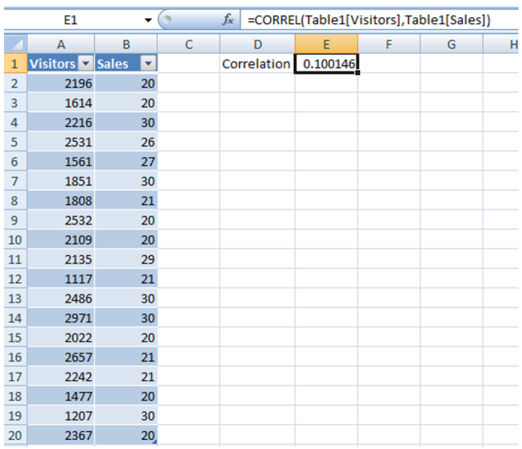
As you can see above we have a correlation between Visits and Sales of 0.1. What does this mean?
- between 0 and 0.3 is considered weak
- between 0.3 and 0.7 is normal
- above 0.7 is strong
The conclusion in our case is that daily visits don’t affect daily sales, which also means that the visitors that you are attracting are not qualified for conversion. You also have to consider your business sense when making a decision. But a correlation of 0.1 may not be overlooked.
If you want to correlate three or more datasets you can use the correlation function from the Data Analysis tool.
Data->Data Analysis->Correlation
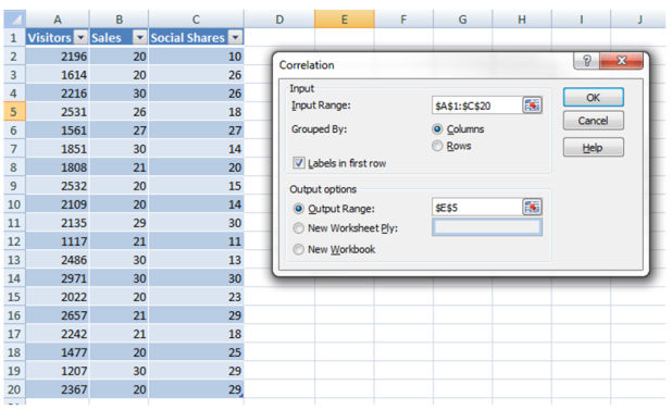
Your result will look similar to this one:
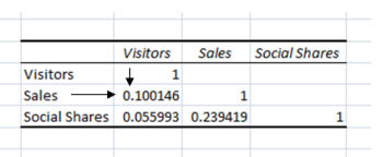
What we can see here is that none of the elements correlate with each other:
- Sales and visitors= correlation of 0.1
- Sales and Social Shares = correlation of 0.23
- Descriptive Statistics for quick analysis
Now you have a pretty good understanding of the mean, standard deviations etc. but calculating each statistical element can take a long time. The Data Analysis tool provides a quick summary of the most common elements.
- Go to Data->Data Analysis-> Descriptive Statistics
- Input Range - select the data you want to analyze
- Output Range - select the cell where you want your table to be displayed
- Check Summary Statistics
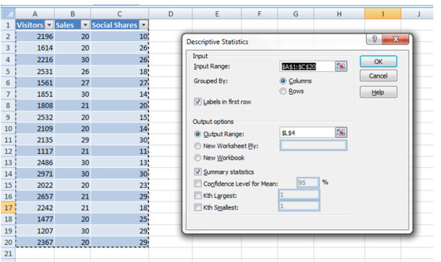
The result is pretty nice:
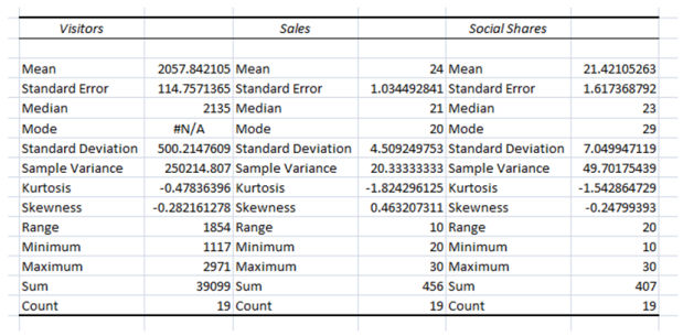
You already know most of the elements but what is new here is Kurtosis and Skewness
Kurtosis explains how far peaked the curve is from the mean, in other words the higher the kurtosis value is the bigger the peak is on the sides, in our case the kurtosis is a very low number which means the values are spread out evenly
Skewness explains if your data is negatively or positively skewed from a normal distribution. Now let me show you more visually what I mean:
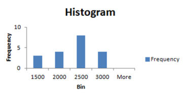
Skeweness: -0.28 (the distribution is more likely oriented towards the higher values 2500 and 3000)
Kurtosis: -0.47 (we have a very small peak deviation from the center)
These are some of the techniques that you can use when analyzing data, the biggest challenge behind statistics and Excel is the ability of applying these techniques in various situations and not being limited to visits or sales. A great example of multiple statistical approaches implemented together was realized by Tom Anthony in his post about Link Profile Tool.
The examples above are just a small fraction of what can be done with statistics and Excel. If you are using other techniques that help you take faster and better decisions I would love to hear about them in the comment section.

If anyone is trying this on a Mac, there is no Analysis ToolPack add in for Mac. The alternative Microsoft recommends is the StatPlus add in. You can find it here: https://www.analystsoft.com/en/products/statplusmacle/.
Fantastic post, Virgil! Love the way you're using histograms to analyze analytics data!
Thank you Annie! Happy New Year!
Thanks Annie,for the Mac Info! I sure wish that Numbers was as powerful as Excel. So wish Apple would make iWork a best in class suite of tools. It's a big failure for them if you ask me, which I know you didn't.
I echo the previous commenters - this is a relevant and well-written blog post. I do have one question: in the downloadable Excel forecasting example, I'm curious as to why the formula in Column E references the values in Column A (Date) versus Column B (Sales). The formula, at least to me, is inconsistent with the following statement:
"Calculate the backcasted non-seasonal data by multiplying the monthly sales by the coefficient from the trandline equation and adding the constant from the equation (column E)"
Thx for helping me correlate the formula with the statement.
I don't understand this too. Why after multiplying the date and coefficient we get backcasted non-seasonal data?
This is superhelpful - thanks so much! I've been telling myself I need to go and learn statistics properly and how to do this type of stuff in Excel - thanks for the kickstart! Def adding this to the new year's resolutions for 201#
Go for it Mark! Hope this post will help you! Happy New Year!
Well Mark, you have come to the right place for all your Excel tutorial and how you gonna infer data for that. Way to go Virgil. And this data analysis is surely gonna be very helpful for formulating the strategies about SEO plans in 2013. I am sure, that we gonna see more such analysis for the internet marketing based on the user patterns.
I like this primer on doing statistics on Excel , thanx for sharing the details!I find myself switching back & forth between excel/mySQL when I do analysis.usually cleaning up the data in xcel before sending it to sql for data sorting/archiving.Cheers!
LOVE pieces like this - as a math n00b, i'm always eager to learn how to use excel tools more effectively to interpret tons of data. Some colleagues believe, though, that Excel's native analysis tools are underpowered so they prefer plugins like StatTools (https://www.palisade.com/stattools/). Do you find that Excel's native plugin has limits?
Looking forward to reading more like this from you, sir!
All the tools are limited is some way, I use excel for daily stuff, if you want to use statistics as a ninja I recommend a software called "R". You will have to hardcode everything or you can use their library, with "R" you almost have no limitations! There is a great class provided by courseera.com which will help you learn this software.
The coursera course teaching R started this week! First assignment and quiz are due Wednesday!
This is great!
One test I've used to make a case for the organic channel is to find correlations between rank and traffic/sales. Watch a first-page keyword with ranking changes over a long period of time, and analyze it next to the traffic and sales (from that keyword). I only use first-page keywords so impressions don't become another variable, and because not enough data comes from page 2 and beyond.
The main source of error here is SERP personalization (which can't really be quantified), but even with this in mind you can find correlations. This is a great time of year to do this type of analysis, because it takes a large sample, say from the entire year. Grab the ranking for that keyword by week (52 data points) or month (12 points) in one column, and the traffic or sales in another column. This will be an inverse correlation since you're expecting the rank go down while traffic goes up. Correlations between ranking and traffic/conversion for an individual keyword might seem like an obvious relationship to some, but as you said, it is very handy when decision making faces uncertainty. Additionally, if you do this analysis for multiple keywords, it can help you decide which ones to focus on by comparing their correlation strengths. :o
There are so many tests which can be done is this data-saturated environment, and this is just one example. Enough thinking for one day.
True! For small data sets I usually brake it down. Your example was a great one! One year can be considered 12 months or 52 weeks or 365 days. Your dataset will increase dramatically and correlation can be calculated more accurately. Or if that data is still not enough you can try forecasting for the next year, it will not going to be super accurate but as long as it's actionable, I recommend it.
Great cases here! Thanks for the detailed examples. Now I know how to spend my weekend ;) I'll tweak my excel for awesome data analysis.
Thanks!
Before I go on a "someone is wrong in the internet" rant, just wanted to say that this article is a good primer on stats for people who are mathophobes or lack specific training. A quick note on your treatment of histograms though:
Firstly, sorting your bins by frequency is not really helpful, as it obscures the "clumpiness" of your data, which is something histograms can show well.
Secondly, it's important to bear in mind that the height of each bar in a proper histogram is not frequency, it's "frequency density", which is frequency/bin size (in other words, if you think of the bar as an ordinary rectangle, frequency is actually the area of the bar). This is less of an issue if all of your bins are the same size, but in your example they aren't (some are 100, others 200).
In your example, your first bin has around 3/4 the frequency of the second bin (34 compared to 44), but it's half the size (100 compared to 200 for the next bin up). So in a proper histogram of this data, bin 1 would have a height of 0.34 (34/100), but bin 2 would have a height of 0.22 (44/200). This is as much a limitation of excel as it is your application of histograms. In general, excel can't draw "proper" histograms (you can't alter the width of individual bars), but so long as you are able to keep your bin sizes the same it can do an okay job of it. So if all bins were 100 length, then you'd be dividing their frequencies by a standard 100, and their relative heights would be meaningful.
So pro-tip: Use a standard bin size across the range of your data when using excel to draw histograms. And don't sort them. For bonus nerd-points, once excel has filled in your frequencies, create a new column next them that calculates what percentage of overall visits fell in that bin, and chart that.
edit: math fail.
Nice article, though there are some points of blur. For instance when you apply the forecast you didn't specify whether you use the entire data range or just a few days. I noticed more the days, more the inaccuracy in regards of current data while at the same time more unrealistic number for the future.
This article is excellent! Exactly what I was looking for as I decided to take the seo-analytic route.
Thanks a lot for this
Very informative and detailed. Bookmarked it for future reference.
I hope you get like a thousand thumbs up because it's worth it.
Cheers
Virgil,Wonderful article with pertinent examples, that I personally find very helpful to the learning process. I would also suggest taking the time to become familiar with Excel's pivot table and data table functionality. Being able to tackle data challenges with Excel's Statistics Pivot tables and Charting capabilities on my tool belt, makes for a lethal combination!
Thanks for taking the time to write this!
This is awesome. It reminds me of my school days. I will definetly use some of this.
One of my college fellow made this type of assignment last year. superb!
Hi Virgil, Thanks for this great post. Analyzing the data is really important in SEO or Digital marketing campaigns. There are a lot of free or paid analyzing tools but we are still not able to understand these sorts of stats. This statistical analysis in excel is really helpful in understanding our Analytics data.
Awesome post mate! Now it's time to spend some time trying it out for real :)
Very helpful post. Great post.
Thanks for great input in using excel for SEO purposes. Finding and using formulars in excel for statistics are often very troublesome, but with the data analysis tool it is much easier!
yes excel is very helpful in SEO reporting as well as to maintain the data in organized way.
EXCELLent read. Indeed. I really really loved excel as everyday am using it but how can I perform this on Google Excel? There are some features of Microsoft Excel that Google Excel doesn't have.
For this, I had been using this and it's great.
It has instructions which can help you.
Exchange Rates in Excel
Just visit the site for more info.
They also have a live support and a forum to help you with your questions.
Thanks for take all the time to write this post, Virgil. Statistics are an essential part of our work, and many people don't care much about them. Thanks for make them easy ;)
Pretty good skills to data statistics, I have exported my years' seo data from google and make useful visual charts, nice article
Even something as simple as looking at different types of averages can reveal the actionable truth behind your data. Great post, I'll be taking the time to try some of the techniques above. ;)
Thanks for the refreshers!
After reading your information i be your die-hard fan. thanks for shearing it.
Very good researched article with lots of statistical data.For SEO Tips: www.etechdiary.com
Good job..nice website,keep up the good work..would like to read more on your blog.
I have been using Excel for awhile now but this takes it to a whole new level for me. Thanks for the outstanding share!
So great to read the post of a fellow Excel Nut. Thanks for enriching our research experience Virgil.
Virgil,Thanks for the post. Nothing, like not giving me any excuses for not doing more in depth analysis.Happy New Year!
Brilliant post. Will be adding this to my reports asap.
Excellent stuff,
I love excel, but never knew i can make this report through it.
Thanks for sharing
Superbly Done SEO & Data Analysis
Oh cool. I love looking at my google analytics. And, I love excel. I don't know why I didn't think of exporting my data before. Thanks for all the ideas. I have lots of them percolating. Thank you.
Insanely helpful! Like how detailed the post was, I agree with Ginsberg will definitely be adding teaching myself stats to the resolution list for 2013!
I am happy to hear that you find something helpful!
This is a fantastic piece. In my humble opinion, marketing is being taken over by nerds and being able to apply stats to practical business forecasting and analyses is huge- both in the executive suite and/or for servicing upper tier clients. If you can get upper level management to start turning toward marketing for revenue forecasting, etc., not only will it increase marketing's credibility but its budget as well.
Very true! Using data to measure and to forecast marketing plans is a must for 2013! Thank you JBeaton!
Please note that Virgil is actually on vacation, so it may take a little longer to get responses, but keep them coming. Thanks for reading!
Oops! I try to avoid posting things when people are on vacation. Apologies in advance to Virgil, but glad everyone is liking the post so far.
No worries Keri!
No problem Kery!
Wow, way WAY too much data for me to process on a holiday but fantastic and thorough post! I've bookmarked it and will tear it apart asap. I love learning this stuff but it's definitely what my wife does best so I'll send this along to her, as well. Thanks!
Makes me wonder if this kind of advanced analysis isn't the future of analytics. If Google Analytics provides us with reports that are not valuable unless we export everything into excel, I would imagine the smart people at Google would be working on these kinds of features in their own software?
An alternative for us is Excel+Google Analytics API. Annie Cushing has a great article about this https://searchengineland.com/how-to-use-the-google-analytics-api-in-plain-english-and-a-free-plugin-139867
Great post. I love having all this info in one place rather than have to go hunting for all the separate pieces. But this makes me wish the Excel version for mac was better
Try using the Mac plugin for Excel from this comment https://www.seomoz.org/blog/excel-statistics-for-seo-and-data-analysis#jtc206012
I can't recall the last time I enjoyed an informative article like I have yours. You've exceeded my high standards and expectations with your excellent writing skills. This is really an excellent repot.
What an excellent comprehensive post. I'ts really opened my eyes to what analysis can be done with Excel!
First of all i would like to say thanks for this informative and useful stuff. I found some new and fresh post.
You put it here, so detail, thanks a lot.
By this method , i have made graphs and analyze all my monthly seo work, Thanks
Great post, I was finding such tips, Now I have learned more.
Love this post, very practical, easy to understand, thanks
Wow, thanks Virgil! You had me at "install the Data Analysis Tool." I didn't even know it existed! Very cool. I know I will be revisitng this post in the future. Awesome job.
Very helpful, willing to get more. Thank you so much Virgil
Just when I thought I was at the end with what I can do with Excel